
Importance of Colour Schemes in Interiors
The primary focus of all the design aspects is an interior design concept. It first exists as an idea, then with meticulous planning, it is made into reality. A successful Interior design course in Pune concept will use colour, space, and style to create a visual theme that subtly expresses a certain atmosphere. Making an idea a reality is an art form. In the above blog we will discuss the Importance of Colour Schemes in Interiors serve as a road map that directs the client’s decisions on the design, aesthetics, colour, material selection, and other specifics.
Encourage artistic work to enhance the interior designing platform.
What is the theory of colour?
An attractive and applicable colour can build your attention easily.
The use of appealing colour schemes in visual interfaces to engage users is based on a set of rules and guidelines known as colour theory. Designers employ a colour wheel and extensively compiled data on human optical ability, psychology, culture, and more to consistently choose the finest colours.
How Does a Design Concept Come About?
Design and develop a pattern that surprises you.
Following a discussion of the space’s goals and objectives between the customer and interior designer, the design concept is created. It’s the stage where interior designer shows off their ingenuity and inventiveness. The educated advice customers receive throughout concept development will assist them in moving the project forward by enabling them to make well-informed design decisions.
As they create a design concept, many interior designers use different approaches. There isn’t a set formula for this process, but every interior designer needs to follow a few basic steps.
For Free, Demo classes Call: 020 71171757
Registration Link: Click Here!
Colour and Its Importance
A design with soothing colours keeps a welcoming touch.
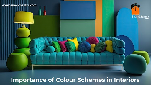
One of the most important and defining features of home design is colour. A decorative scheme’s success or failure is significantly influenced by the colour choices made. A unified and appealing outcome can be achieved by carefully using colours to tie together furniture and finishes. To achieve the intended effect, the designer should let the visual design concept (derived from the brief) and consideration of the shape and proportions of a room guide and inform the use of hues. Colour plays a significant part in setting the mood of a scheme.
A room’s apparent size or proportions can also be altered by colour, making small spaces appear larger and vast ones appear smaller. It can make oppressively low ceilings appear higher or lower optically. It can make an otherwise gloomy space more cheerful or cosier than it would otherwise be. The use of colour can either serve as the ornamental scheme’s focal point or just as a background. It is also possible to utilise specific colours to conjure up specific historical eras.
It is helpful to evaluate the effects of colour choices using colour perspective sketches and elevations. Mood boards, and especially sample boards, are a helpful collection of colour swatches, material samples, images, and styles that allow designers to evaluate how crucial certain characteristics of the chosen materials are.
Decorate your interiors with dimensional views and pitching colours.
Whirl of Colour
A useful tool for examining how colours relate to one another is the colour wheel. It links the ends of the line to form a circle, symbolising the linear spectrum of visible light, which ranges in hue from red to violet. The colour wheel makes it possible to see and identify harmonious colour combinations (colour harmonies).
Sir Isaac Newton, who in the mid-17th century discovered the visible spectrum of light, is credited with creating the first colour wheel in the early 18th century. Newton observed that when the revolving disc rotates quickly, the primary and secondary colours mix together and the eye perceives white.
For design harmony, use a colour palette and colour temperature.
Red, green, and blue are the primary colours used in the additive colour model for screen design. The use of colour should be optimised for your users’ experience in appealing interfaces with great usability, just as you must strategically put images and other visual design elements. Any of the following primary colour schemes might be used as a starting point for your design process:
Use colours effectively and do not use the rightful colours incompetently.
- Monochromatic: Using only one colour and its various shades and tints, other elements are created.
- Using three colours that are next to one another on the colour wheel, such as orange, yellow-orange, and yellow to depict sunlight, is known as the analogous technique. To create a “high-key” comparable colour scheme (such as flames), another option is to combine white with these.
- Use “opposite colour” pairs, such as blue and yellow, to increase contrast when using complementary colours.
- Split-complimentary (or Compound Harmony): To soften contrast, add hues from either side of your complimentary colour combination.
- Triadic: Choose three colours that are equally far from one another on the colour wheel (i.e., 120° apart, such as red, blue, and yellow). Although the colour palette may not be vivid, it nonetheless retains harmony and sharp contrast. This makes creating designs with visual appeal simpler than using a complementary colour scheme.
- Tetradic: Choose one dominating colour from a group of four colours that are two sets of complementary pairs, such as orange, yellow, blue, and violet. This permits intricate, captivating designs. However, pay attention to how warm and cold colours are combined.
- Four colours are evenly placed (i.e., 90° apart) on the colour wheel in a square pattern, a variation of the tetradic pattern.
For Free, Demo classes Call: 020 71171757
Registration Link: Click Here!
Your brand’s personality and design objectives should be reflected in your colour choices. To maximise a favourable psychological influence on consumers, you should also use colour theory. As a result, you should carefully consider how the colour temperature—that is, how your usage of warm, neutral, and cold colours—reflects your message. According to elements like the nature of your organisation and the sector, you might, for instance, make a neutral colour like grey warm or chilly.
Track the beauty to enhance the richness of your design.
Do watch our Latest Shorts on Interior Design: Click here
Conclusion
The interior design sector has a huge and thriving scope. Remodelling, improving, and restoring a residence, office building, or infrastructure are all included in the interior designing services. Through sophisticated yet beautiful designs, it is a clever science that strives to improve a place in order to establish a healthier environment inside a home. Everything from the functional—furniture for homes and offices—to the conceptual and artistic—are included in the scope of Interior design course in Pune.
Your enthusiasm for learning Interior designing Training in Pune can be fruitful if you enrol in our institute SevenMentor & Technology Pvt. Ltd. You can design different crafts regarding your views and based on different colour shades. This creates a wondering design developed by designers and artistic-minded people. Our talented trainers will train you to gain worthwhile concepts of the course while your learning.